Intracom Website Redesign
Year: 2024
My Role: UX Designer
Intracom is a company that develops a software called VCOM. VCOM is an audio communications app designed for scenarios where communication among team members is high priority. Their website was dated and had a lacking UX. I redesigned the website entirely with the goal of improving credibility, product education, and visual design. The redesigned website is live and can be viewed at IntracomSystems.com.
Project Outcome
2x
Increase in Visitors
2.5x
Increase in Page Views
1.5x
Increase in Leads
Research
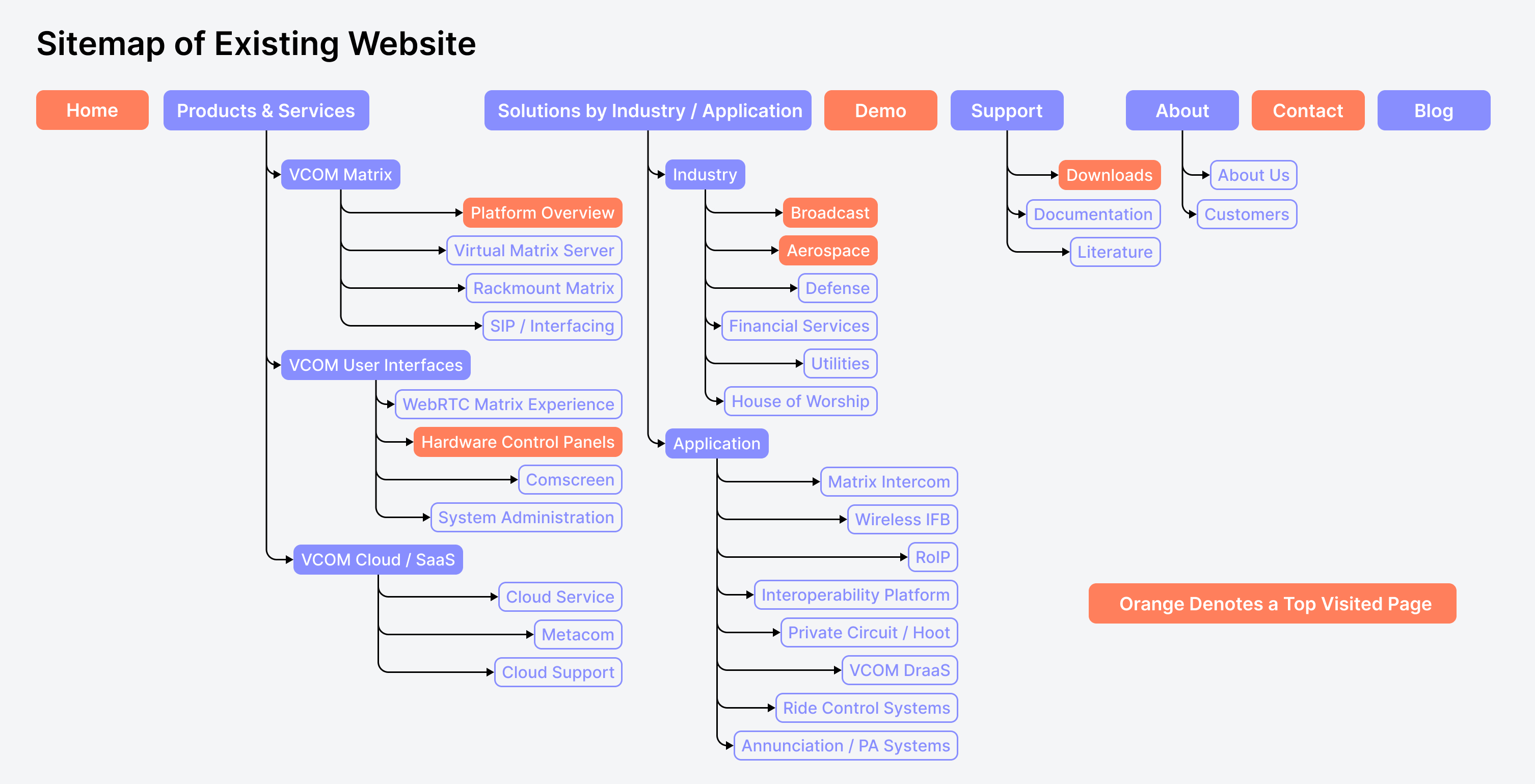
I began by looking into the web analytics of the website to gain a better understanding of how the website was used and to find the most visited (most important) pages. I found that there were a handful of pages that received the vast majority of visits while many of the other pages on the website were rarely visited.
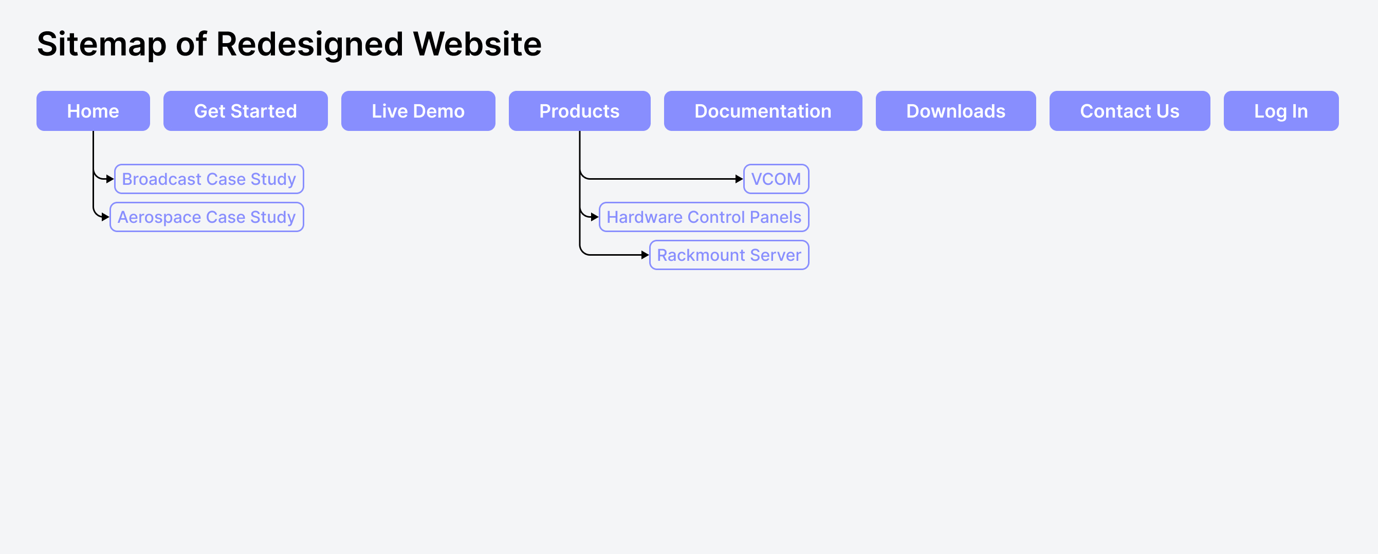
For the redesign I only kept the top most visited pages as these were the pages that users needed. By heavily reducing the page count we improved navigation. Removing the least visited pages would also boost SEO.
UX Audit of Existing Website
Intracom's 10+ year old wordpress website was showing its age. Many of its pages contained outdated content, the overall style of the website was dated, and it provided a poor UX due to its cumbersome navigation.
Home Page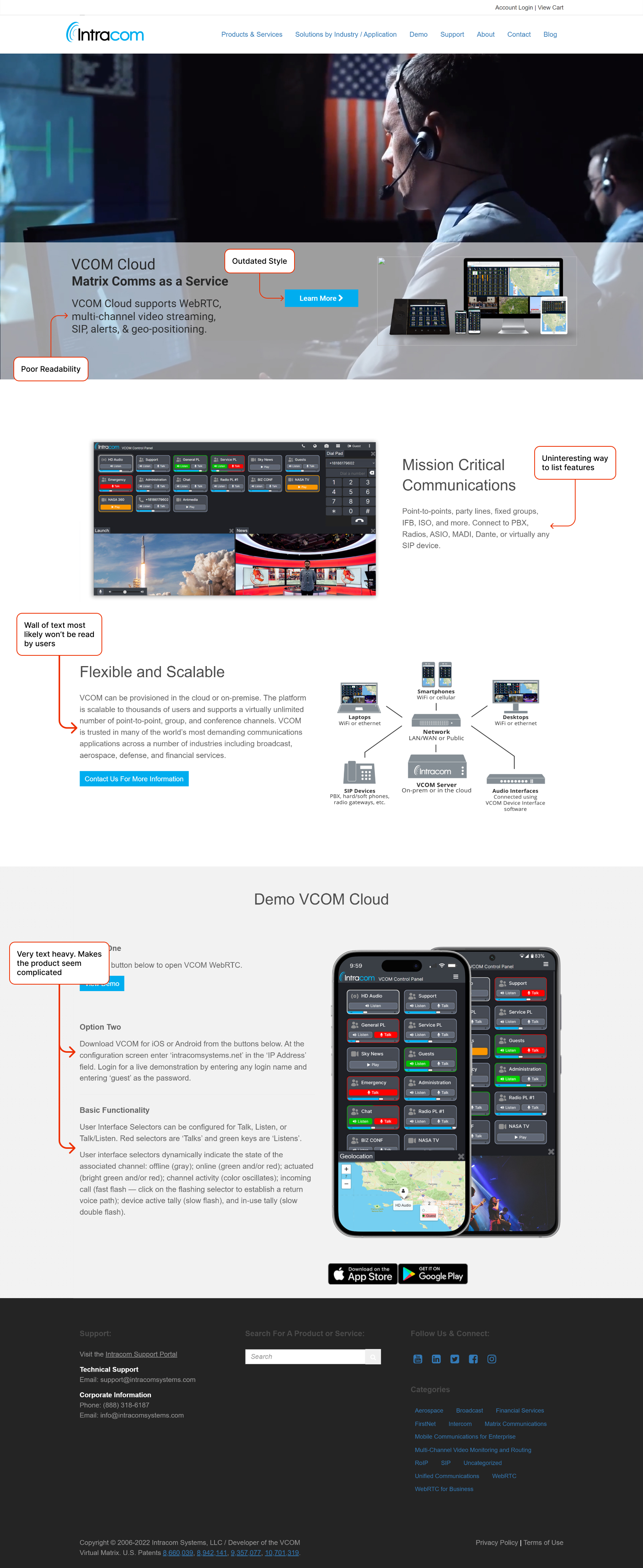
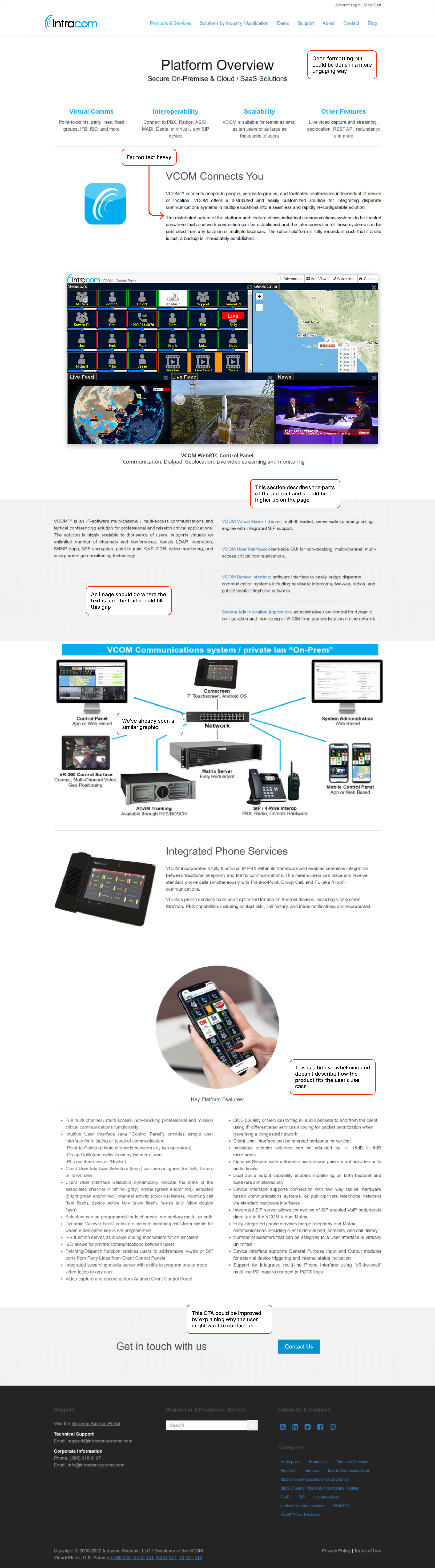
Main Areas for Improvement
01
Intracom is a small company that serves critical communications needs of large organizations. As such, credibility is important for winning new customers.
02
With a cluttered navigation and lack of information on the website is was challenging for customers to learn about our product.
03
The website is often the first touchpoint between Intracom and potential customers. An outdated design can make a poor first impression.
User Flow Diagram
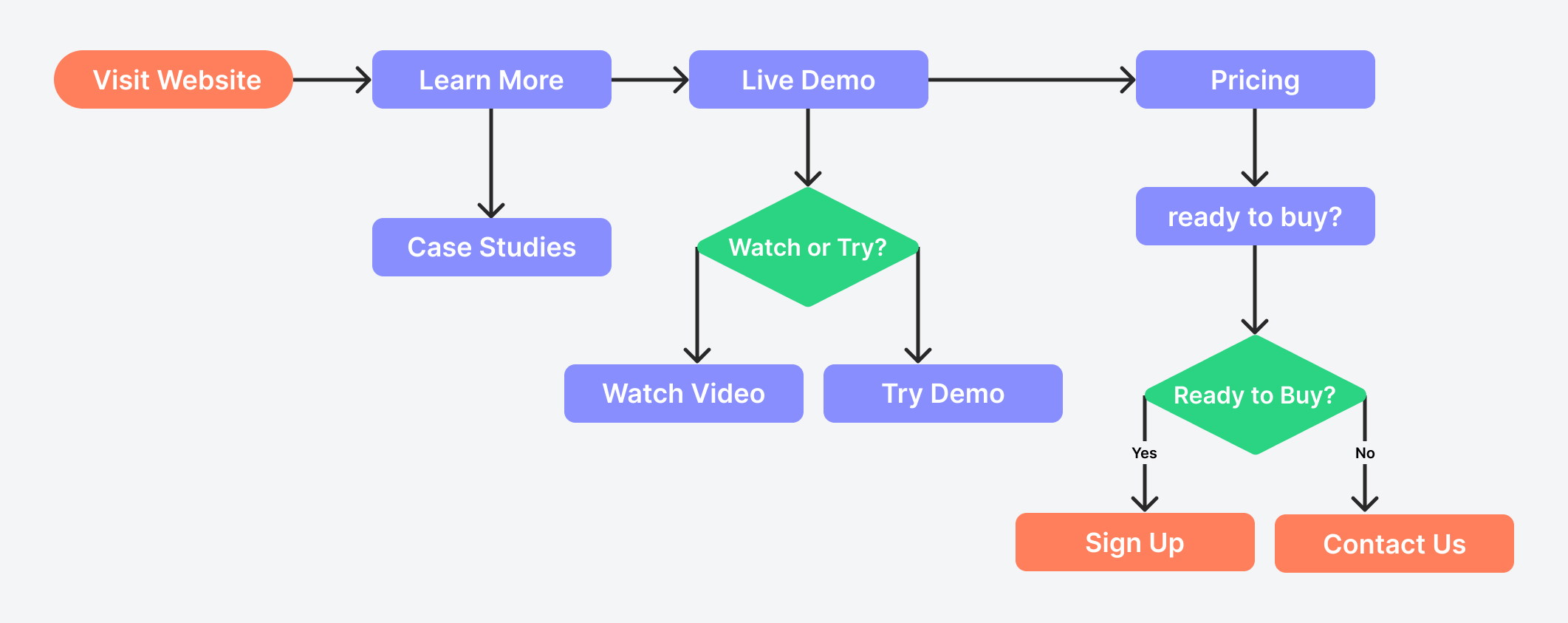
There are two main endpoints for the user flow. Customers will either sign up for our subscription or contact us for assistance. The pages on the site were designed to facilitate this process by gaining the user's interest with engaging images and animations. Once the user is interested in our product they can follow along with the links on the site to learn more.
Style Guide
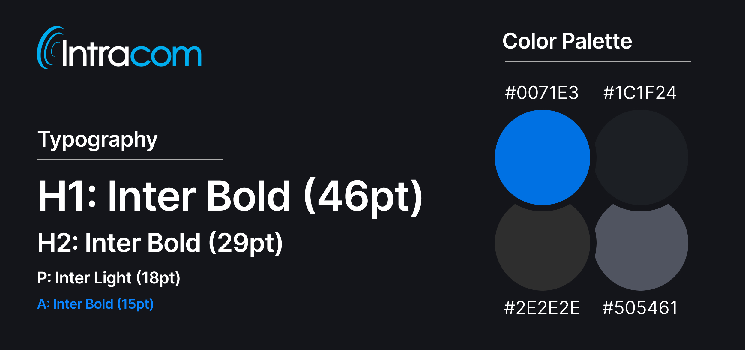
The website's style was completely overhauled. We opted for a modern design complete with large corner radiuses, generous white-space, and a dark-mode theme. The company's product, VCOM, is typically used in low-light control rooms and had a dark-mode by default to reduce eye strain. We decided to carry the dark theme over to the website to better align our overall brand style.
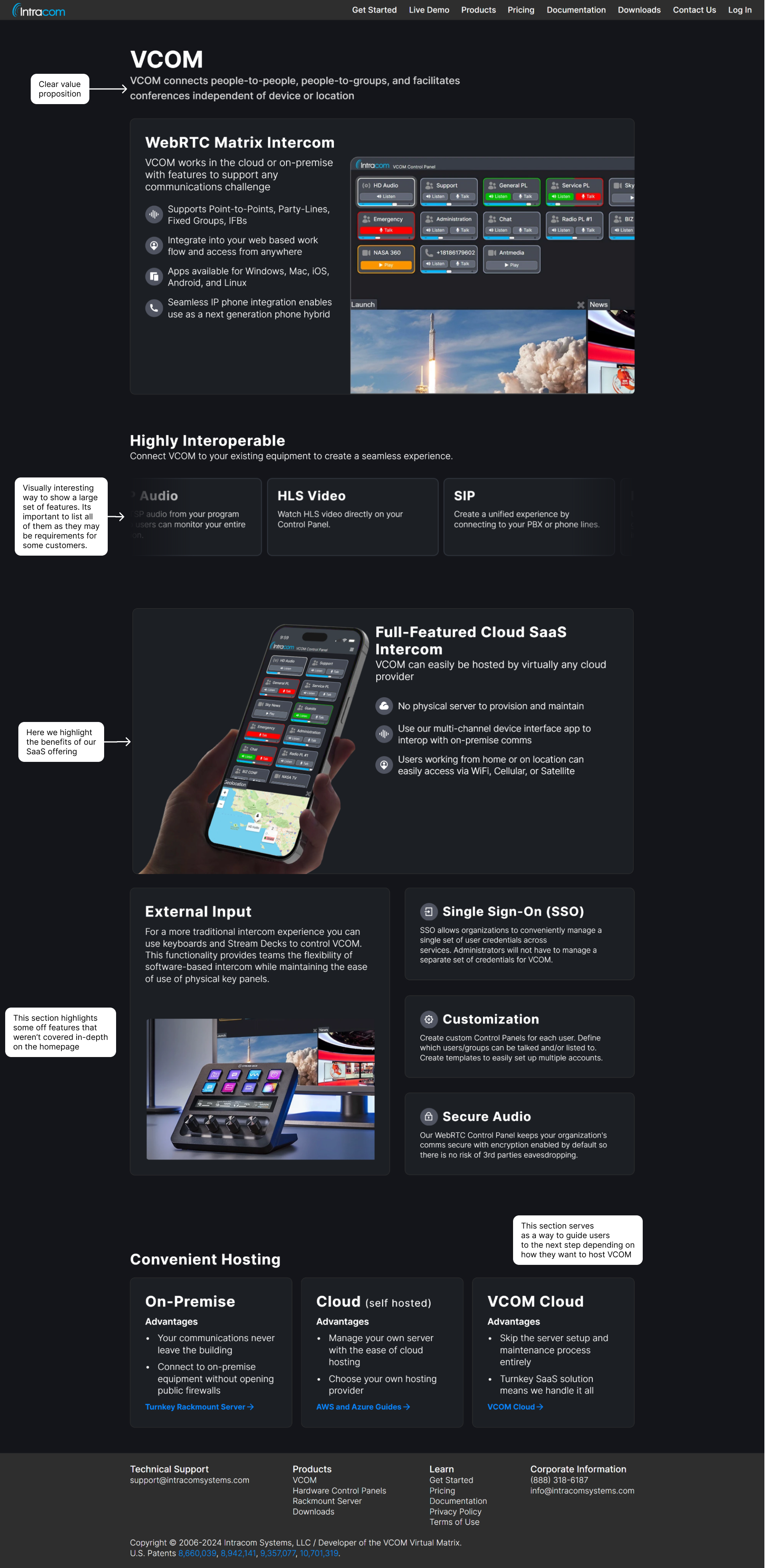
Redesign
The redesigned website is live and can be viewed here: IntracomSystems.com.
Homepage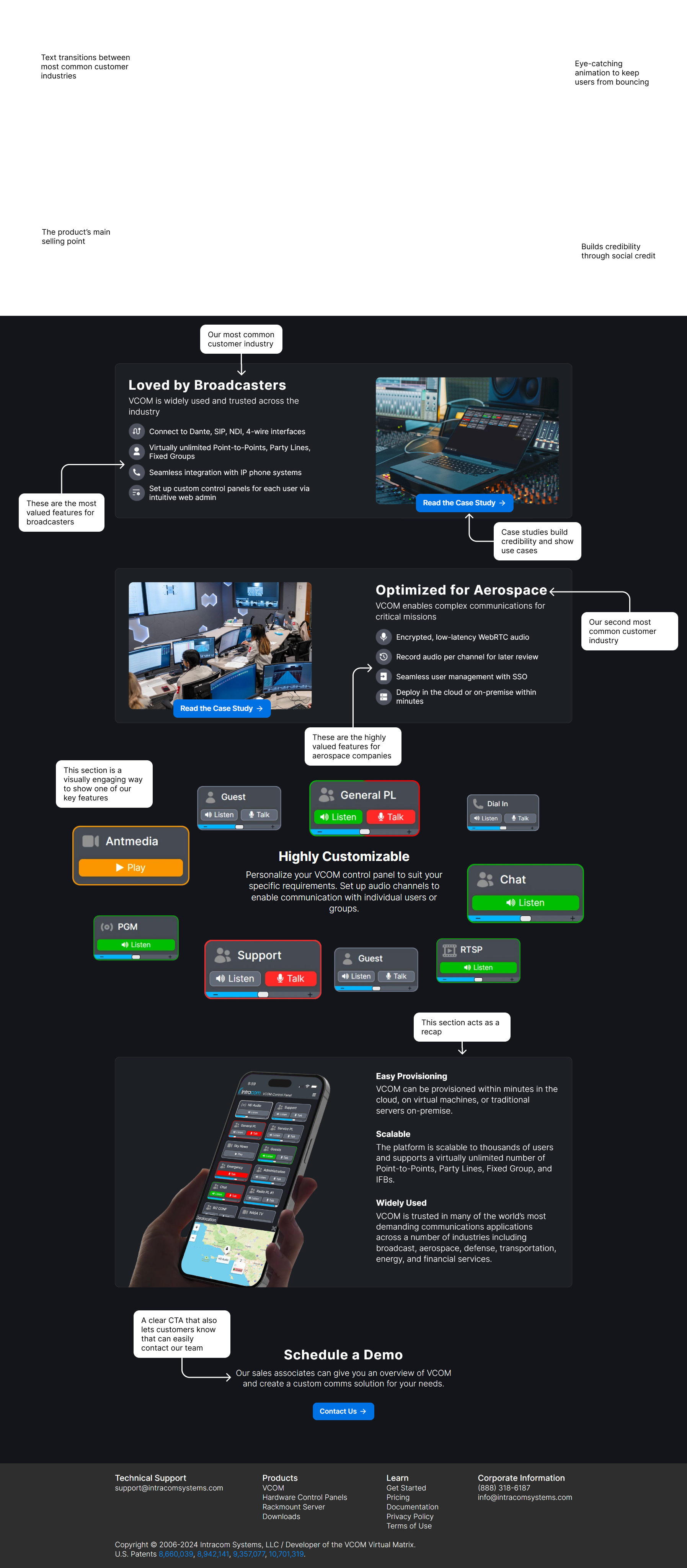
Results
Post-launch, the redesigned website saw a 2x increase visitors, a 2.5x increase in page views and we received a 1.5x increase in leads, affirming its effectiveness in improving user engagement and driving business results. We also noticed a shift in the types of questions we received when potential customers reached out to us; rather than asking about the product's capabilities their questions became more targeted at how the product could fit their specific use case. This indicated that the new website did a better job of educating customers on the product.
Reflection
The initiative to redesign Intracom's website led to a significant improvement in the online presence, making it more engaging and easier to navigate. By focusing on user needs and highlighting social credit, we not only modernized the site but also showcased our strong customer relationships and success stories, contributing to the project's overwhelming success.