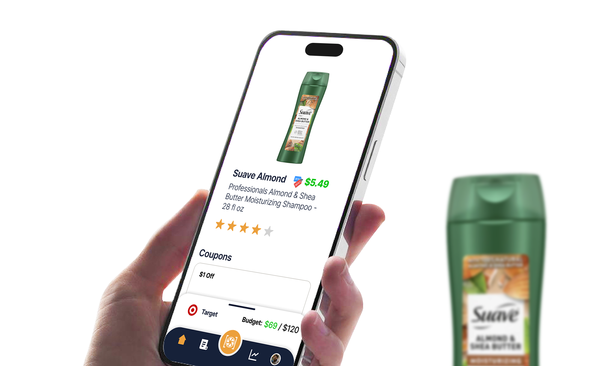
ShopVision
ShopVision is an AR-based in-person shopping app.
Year: 2023
My Role: UX Researcher and Designer
Shopping in-person doesn’t have the benefits of online shopping that digital-natives are accustomed to such as price/product comparisons, reviews, and recommendations. My team decided to build an app bridges the gap between online shopping and shopping in-person. Our target demographic was price conscious digital-natives.
Research
Persona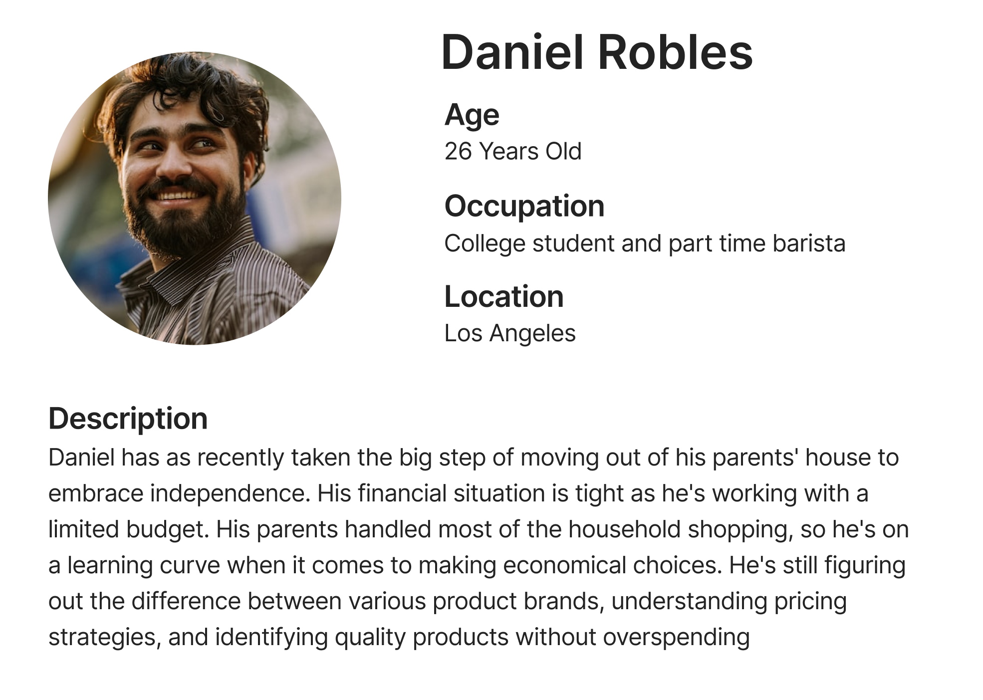
We created a persona to better understand our target demographic.
Ideation
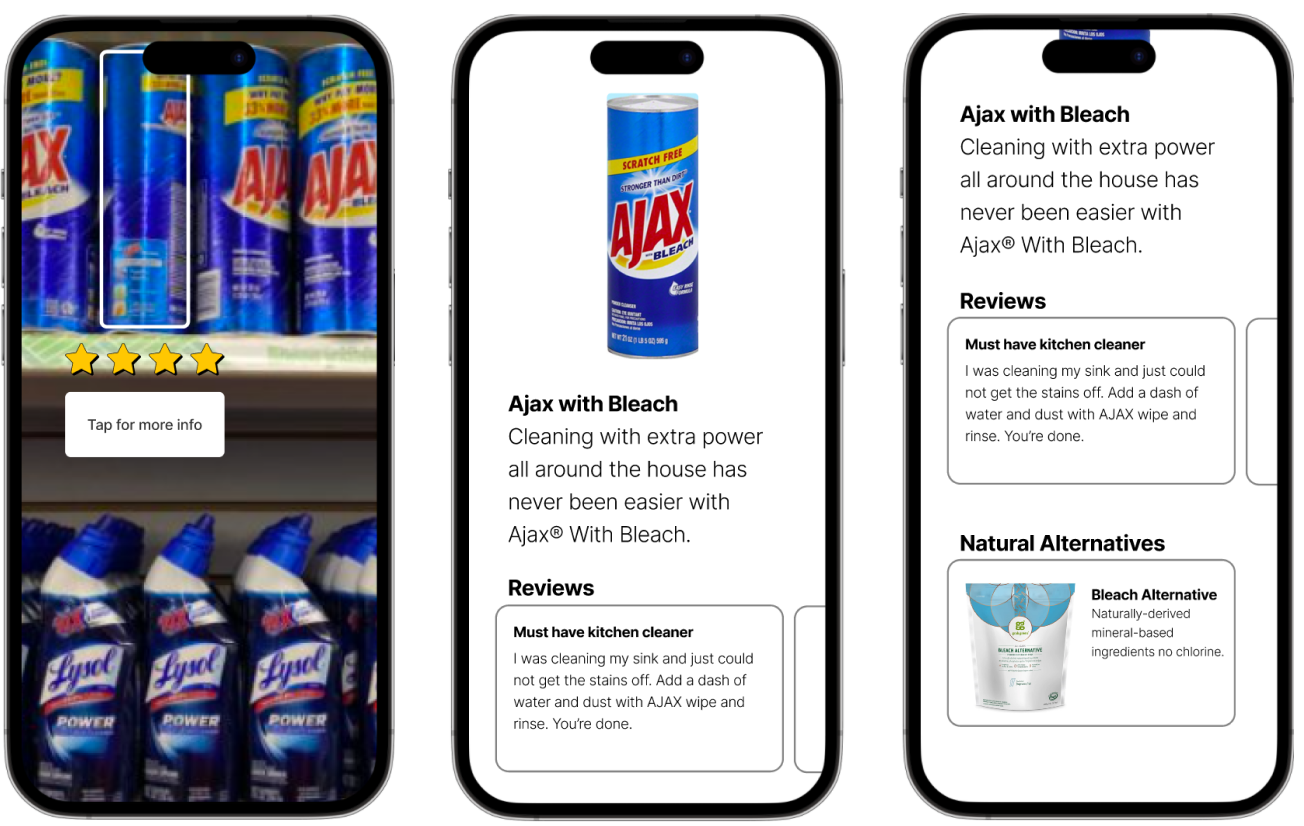
We came up with a variety of different ways to tackle this problem. We explored the idea of an AI chatbot assistant, a product review based social media platform, etc. We settled on an AR-based app that can identify products using machine vision and provide reviews, alternatives, etc.
Storyboard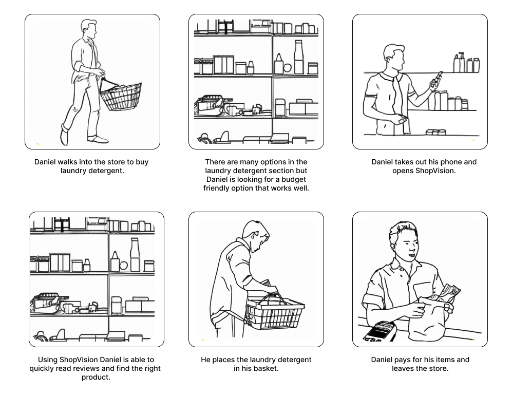
We created a storyboard to outline how and when the app would be used. This helped us to better understand the context it would be used in. We used Dall-E to generate the images.
Style Guide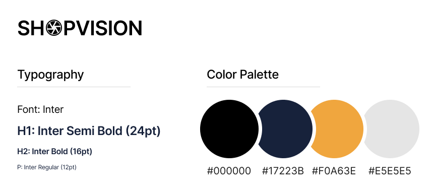
A style guide and logo was created to define the brand identity. We picked out colors that would stand out and chose a readable font with high contrast. Typography was especially important as we wanted to make the app as usable as possible for quick usage in busy environments.
Prototype One
Prototyping the app was a challenge because Figma does not have any AR capabilities. To get around this limitation, I came up with the idea of developing a webpage for the AR functionality. The webpage contains embedded Figma prototypes. There is a transparent <div/> covering the middle AR button and we detect when it is pressed using JavaScript. When it is pressed we hide the Figma embed and instead show the user's camera preview.
At this stage the prototype did not have any machine vision capabilities. The popup to learn more about the product shows after a 5 second delay. We found in our testing that this was convincing enough to simulate the experience.
User Testing
We set up a shelf with a handful of products to mimic a store shelf along with tags for pricing. Creating an environment similar to the context the app would be used in was necessary to provide an accurate test. We found five participants in our target demographic. We gave them a brief description of the app and told them they can press the camera icon and scan the shampoo. In our testing we found that users understood the concept right away and saw the value in it. Below are the main usability issues we discovered.
To address this issue we removed the logo from the heading.
To address this we included a location pin icon to indicate that the store is based on the user's location.
We replaced this copy with "Budget Friendly."
We added a way to thumbs up/down reviews.
This feedback was interesting as we had initially considered this feature but didn't implement it since we thought users likely already used their notes app as a shopping list. However based on the feedback we added in a shopping list and integrated it neatly with the rest of the app.
Prototype Two
The first prototype validated the app's main use case. For our second prototype we added in additional features such as a shopping list and price tracker to make the app more useful. For this prototype we wanted the user to be able to scan a variety of different products. We used Google's Teachable Machine to train a computer vision algorithm to recognize three different shampoo bottles. In the prototype if the model detected one of the bottle types we then showed the relevant Figma screen.
User Testing
For our second round of user testing we followed the same format as the first round. Below are the main points of feedback we received.
We removed this feature so we could focus on other ones.
We added in a feature to scan all the items in your shopping cart to easily calculate a total cost.
Reflection
This project was fun to work on and helped me refine my user testing skills. I enjoyed setting up a user testing scenario with fake store shelves and watching users interact with our designs. The user testing involved more setup than I am used to however the results were well worth the additional effort.
