VCOM
VCOM is a mission-critical communications platform that I redesigned.
Year: 2023
My Role: UX Engineer
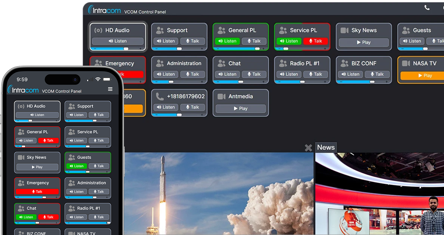
VCOM is an audio communications app designed for mission-critical scenarios where communication among team members is high priority. VCOM is widely used for communications during rocket launches, TV broadcasts, and financial trading. I was tasked with redesigning the UI for our upcoming version 7 release.
How does it work?
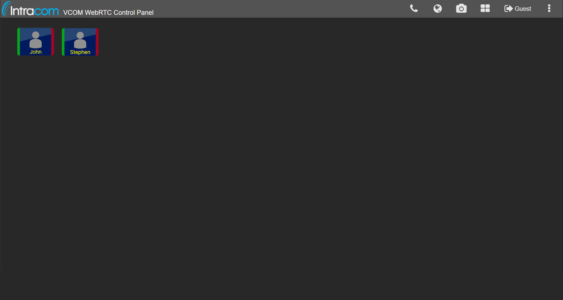
VCOM allows for a user to talk to 1 or many users with a single click. Users are arranged on screen as a grid of buttons (called selectors). Pressing the green bar of a selector allows you to listen to that user. Pressing the red bar allows you to talk to that user. A selector with a white background indicates that they are speaking.
Research
To gain an understanding of the challenges faced by our users I analyzed support email threads from the past several years. I discovered a pattern of usability issues that would cause users to have to reach out to support (detailed below). I also actively participated in the sales team's product demonstrations and made note of any friction points that new users experienced. With this research I was able to identify key areas for improvement.
Areas for Improvement
01
One of the most common issues is that a user would forget to turn their talk button off. I attributed this to the fact that the UI does not do a good enough job of indicating that a talk button is on. This is a serious issue as it can cause the person on the other end to not be able to hear other users.
02
During demos with customers I noticed a high learning curve with selectors and the UI in general. It was not immediately clear to users what VCOM does or how to use it. This was mainly caused by a lack of signifiers.
03
The UI style itself had aged and it was time to modernize the look.
Ideation
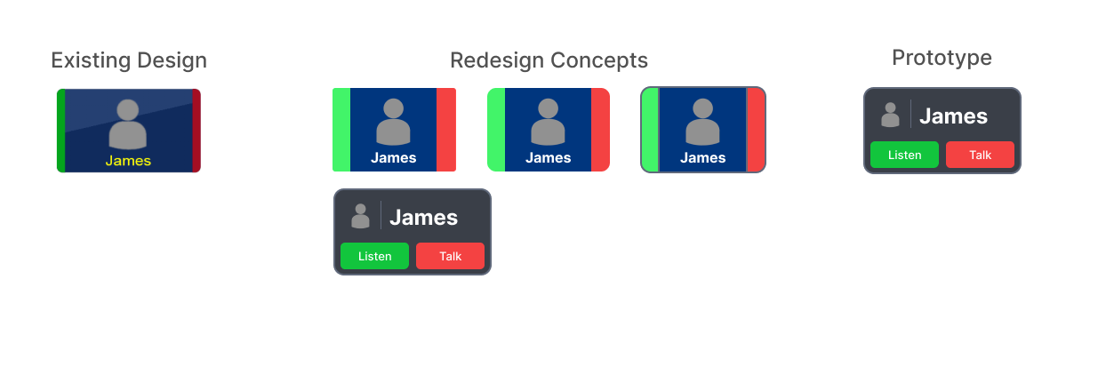
Selectors are challenging to design due to their variability. The names can be short or long, there may only be a talk button, a listen button, or both, and they have to be responsive. To better signify their function the redesign included buttons labeled "Listen" and "Talk".
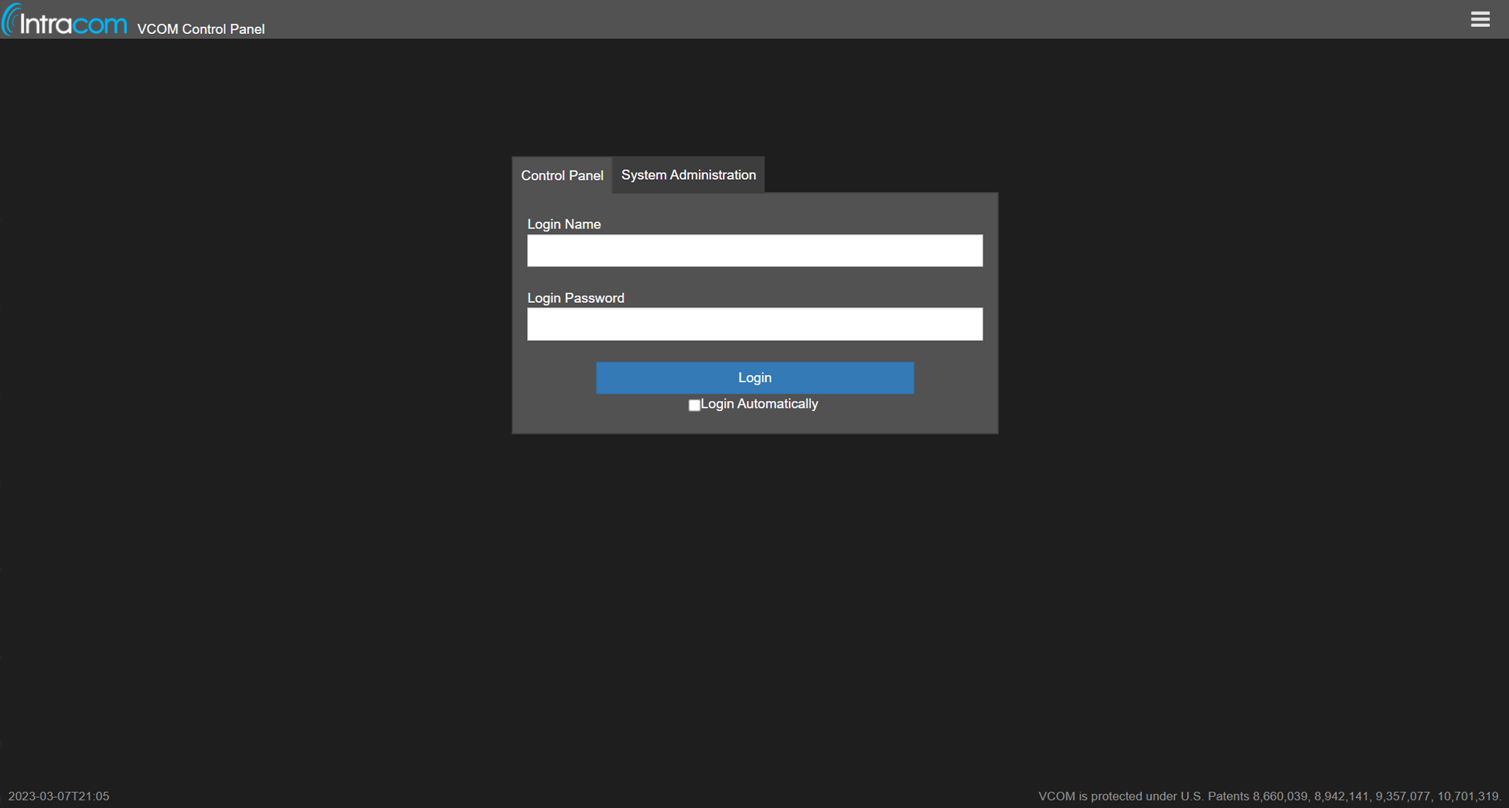
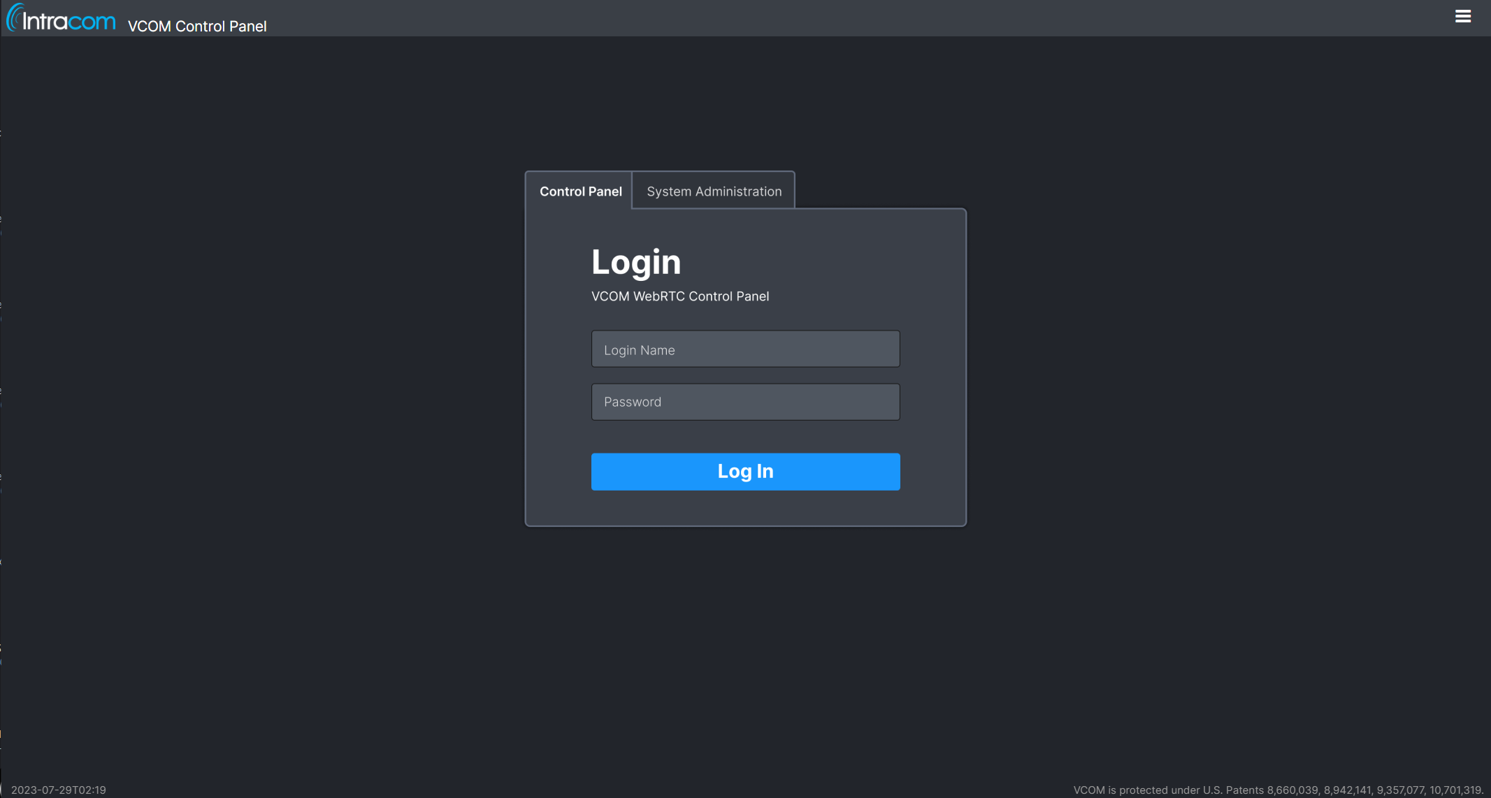
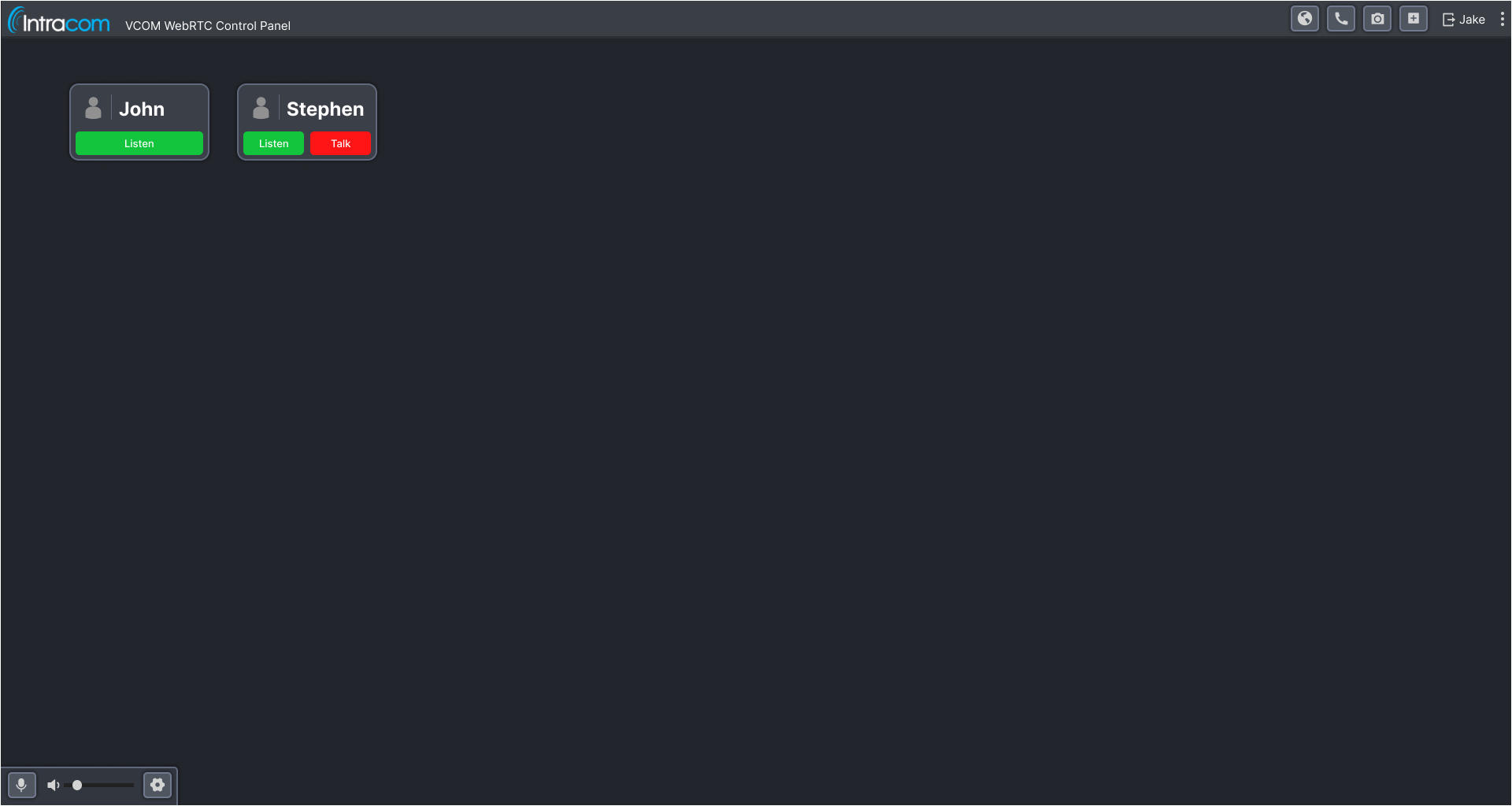
The login page was redesigned to have a more modern look and feel. On the Control Panel, in addition to the selector changes a microphone and volume control bar was added as this is a staple of nearly all communications apps.
Figma Prototype
Click to enlarge
I created a Figma prototype of the new design, presented it to both the CEO and CTO, and explained the reasoning behind my design decisions. Both were happy with the new design and I was approved to begin implementing it. The majority of the work I do for Intracom is design focused however by also handling the development for this project I could ensure the designs are implemented perfectly and could iterate more efficiently.
Functional Prototype
The original VCOM design uses green for listening and red for talking which was retained for user familiarity. In the redesign, the selector's border now indicates whether the listen or talk buttons are active making it more noticeable and preventing them from accidentally leaving the button on.
In the original design a white selector background would indicate that a user is talking. In my research I discovered this was not inherently clear to new users. I looked for design patterns in related apps and found that outward ripples or pulses were common ways to indicate voice activity. I implemented this design in the new UI however it was important not to confuse existing users. To keep the design familiar we use a white border.
User Testing Part 1
We then went to a small group of trusted users who have given valuable feedback in the past.
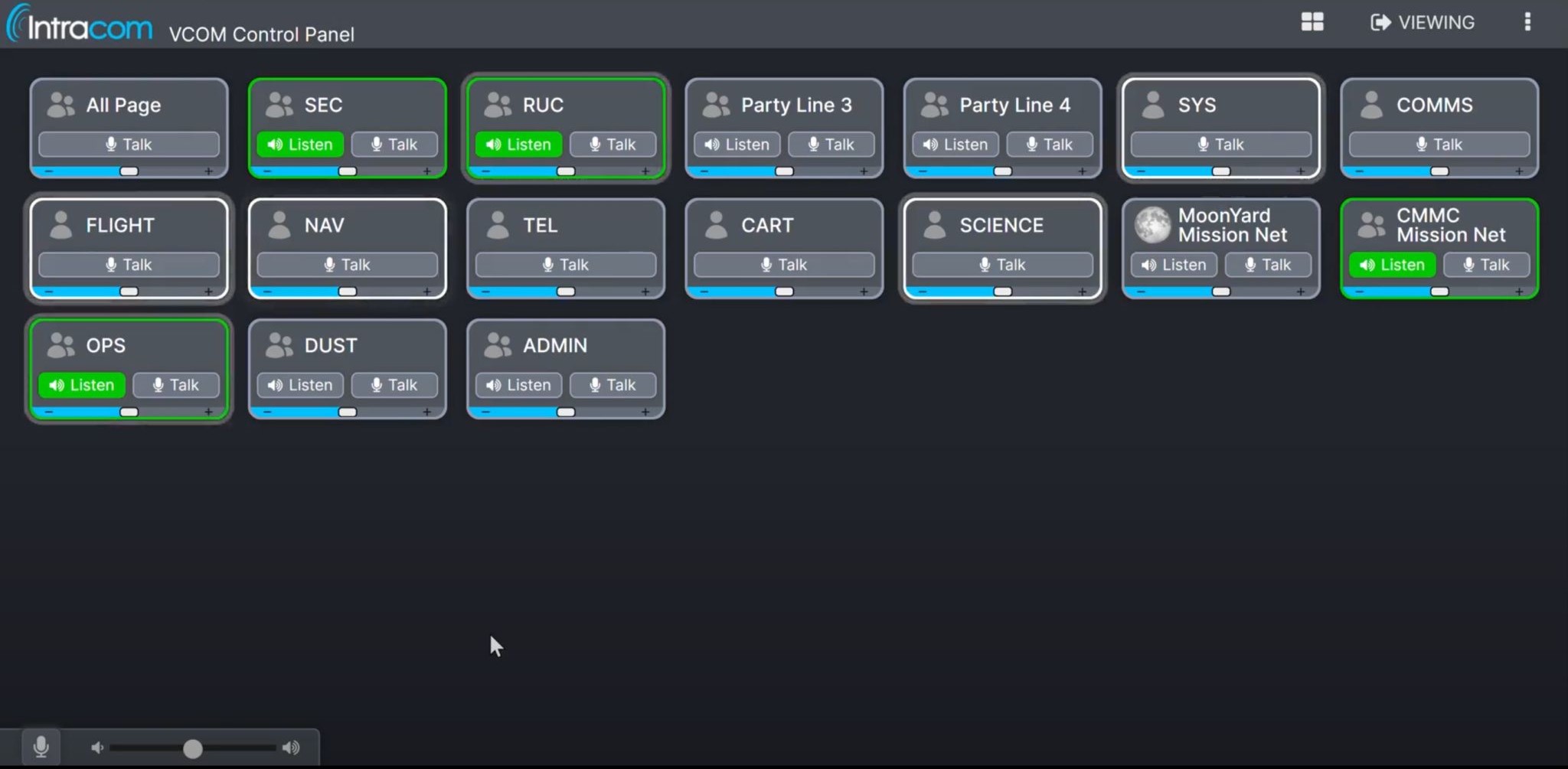
In VCOM, when a user is not logged in their selector is shown greyed-out. In the next iteration the selectors colors were brightened. I included a thin, light stroke around the talk and listen buttons and adjusted the box shadow. This made the selectors much more lively.
I greatly decreased the brightness of the ripple animation.
I added speaker and mic icons to more clearly communicate the button's purpose to new users who might not understand the terms "talk" and "listen."
We added in a prompt to ask users if they want to upgrade to the redesign
User Testing Part 2
For the second user testing round I greatly decreased the brightness of the ripple animation. Additionally, At this point the redesign could be used in production. We made it available to 4 separate organizations including dozens of users.
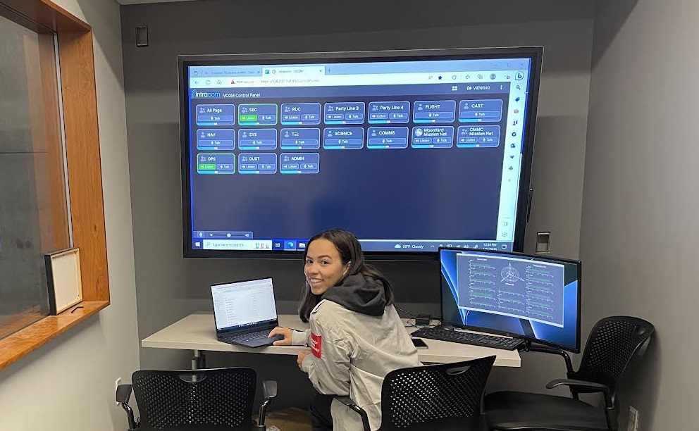
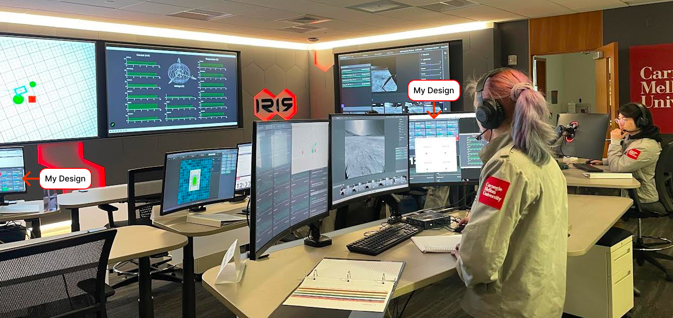
Intracom provided VCOM to Carnegie Mellon University to supported the launch of their Iris Lunar Rover. Below is a look at how CMU set up and used the redesigned Control Panel. More details are available in their LinkedIn post. The test was a huge success and involved many students learning how to use VCOM. The redesign greatly decreased the learning curve.
Below are some examples of the overwhelmingly positive feedback we received.
"I like the new look and to me looks like the buttons are organized better for a user to differentiate talks from listens."
"Sexy interface keep going :)"
"I love the new layout!"
Reflection
It was a rewarding experience to see my designs progress from a mockup to production software used regularly. This case study is a good example of the value that a UX Engineer brings to small teams. Even though I am not the lead frontend developer at Intracom I was able to put my development skills to use where they really count.